How to read the maps

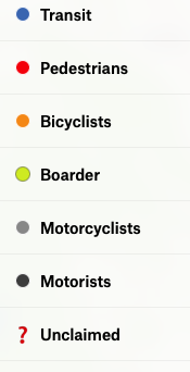
Map Key - Victims
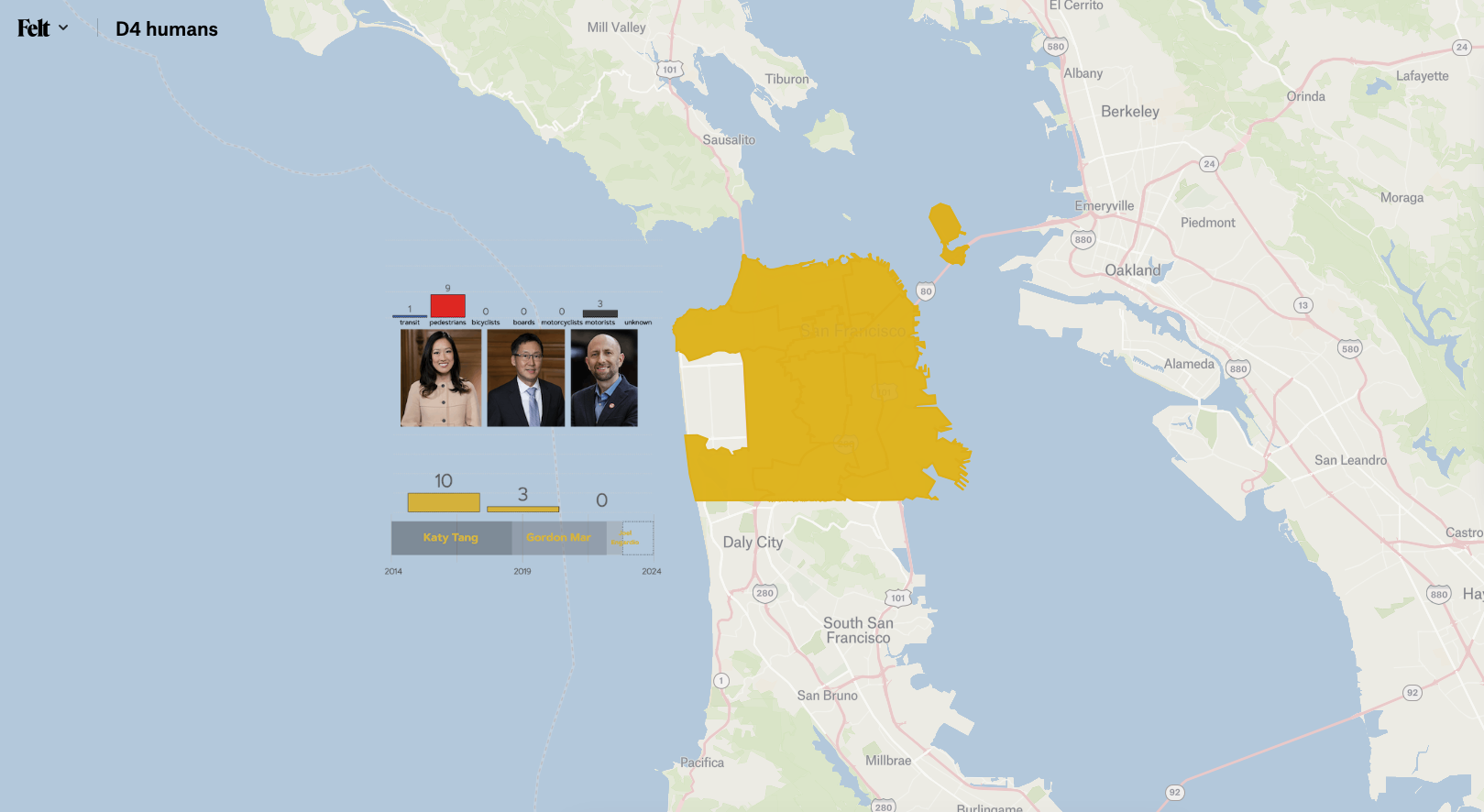
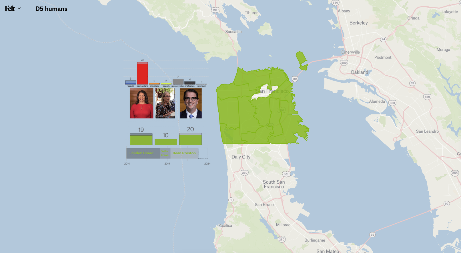
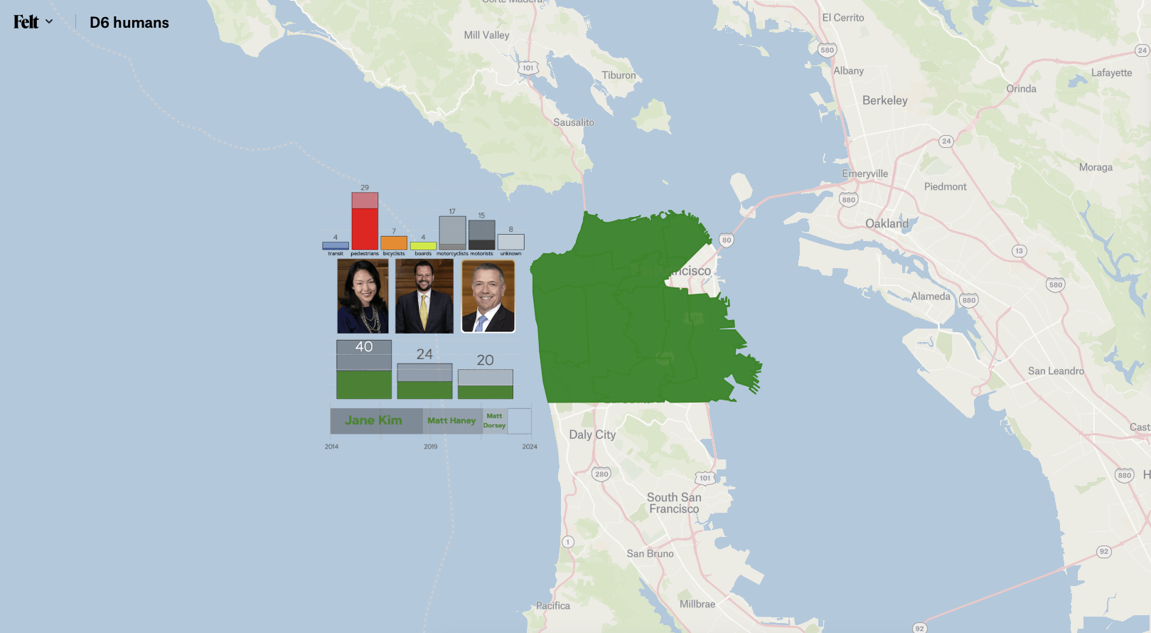
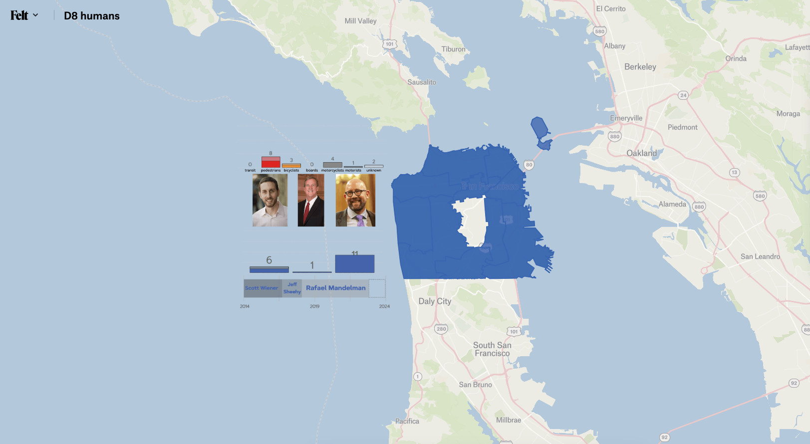
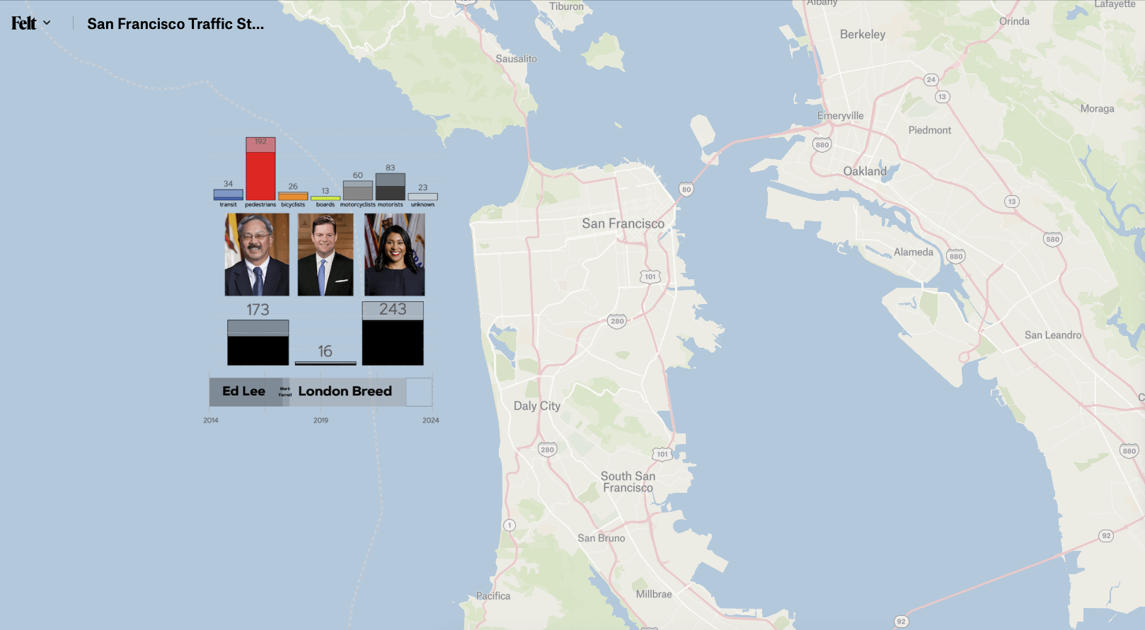
Charts
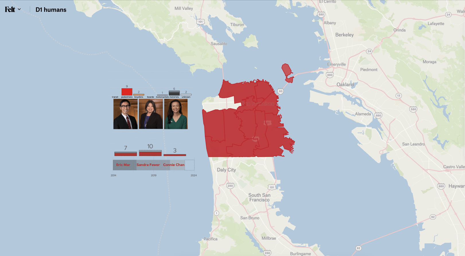
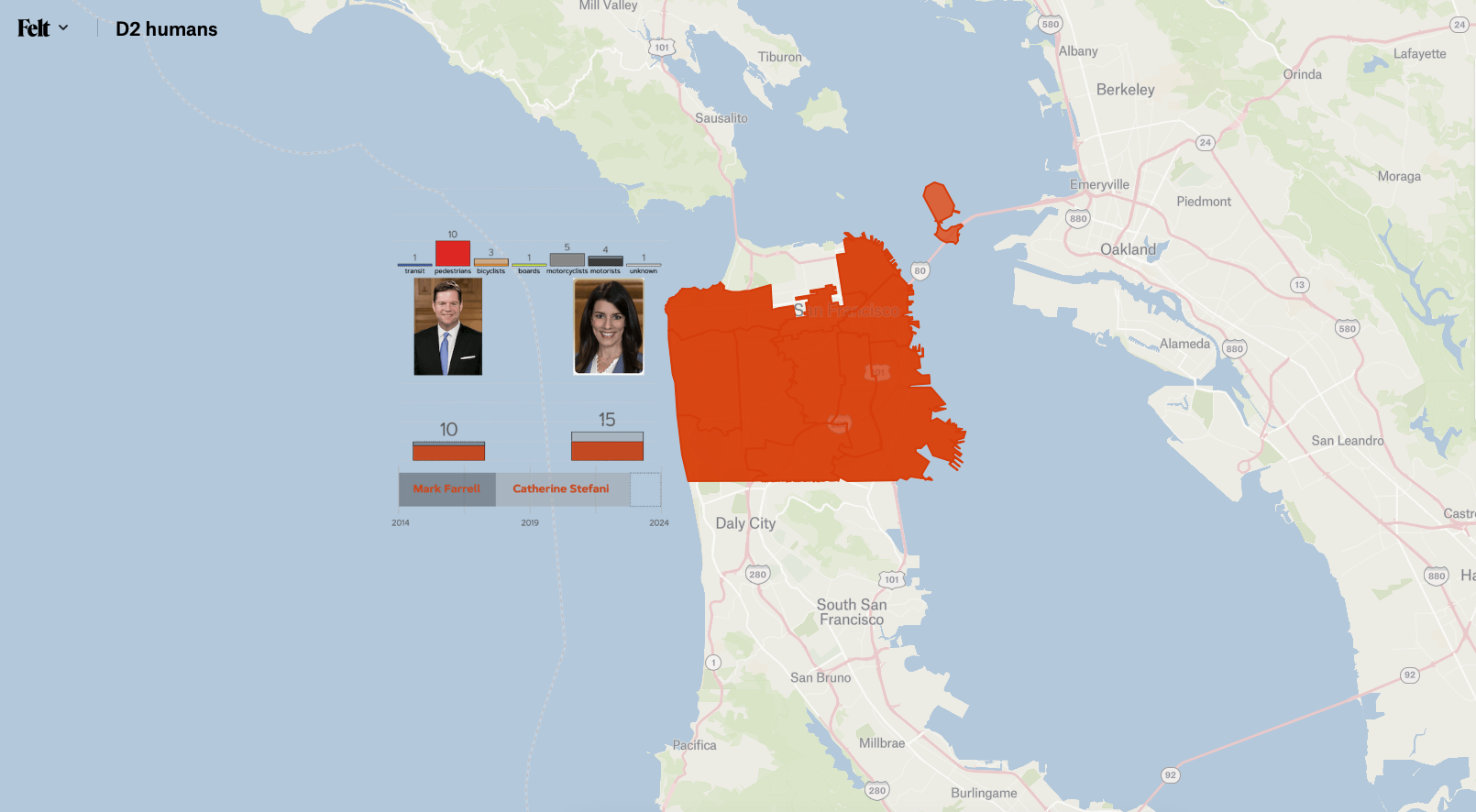
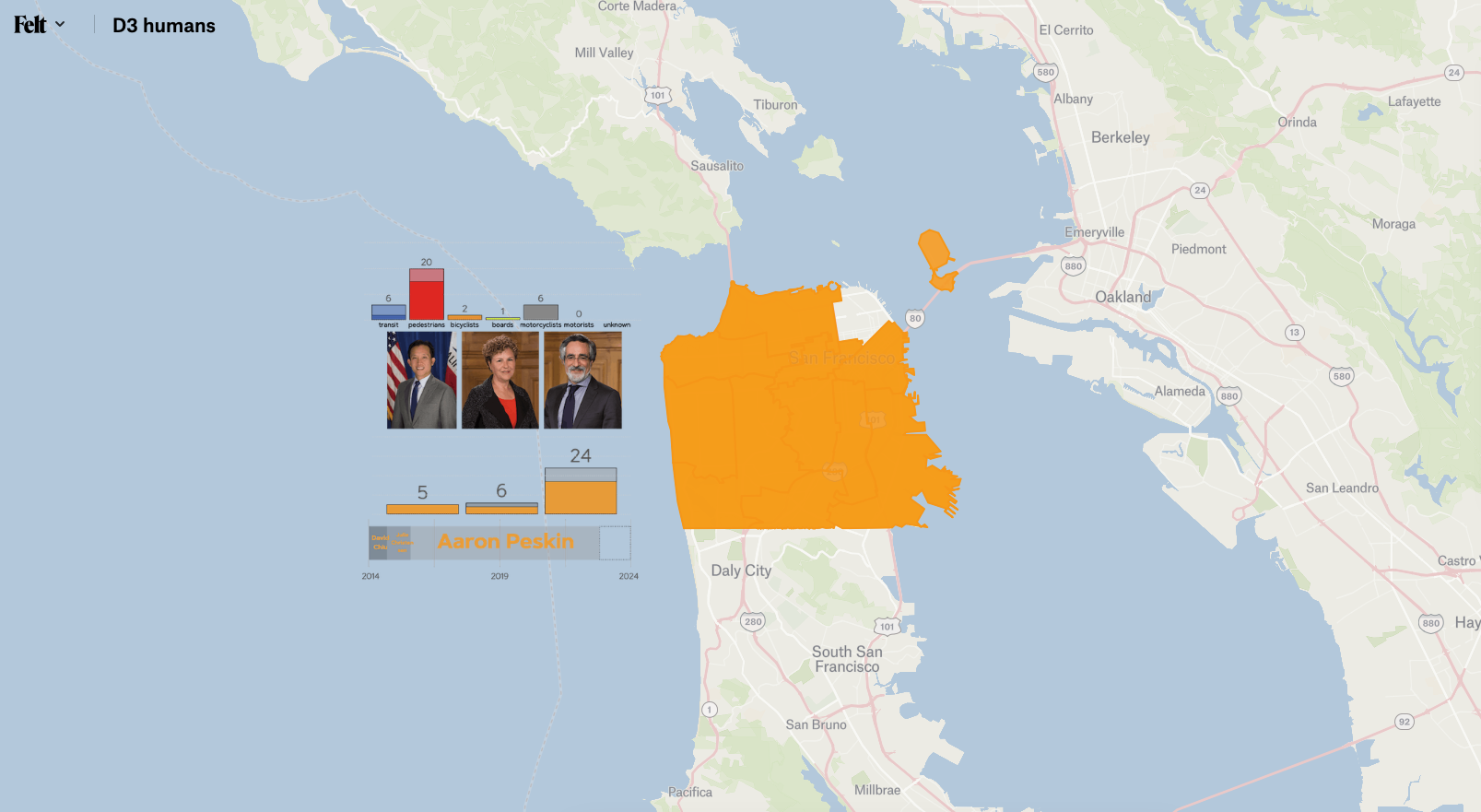
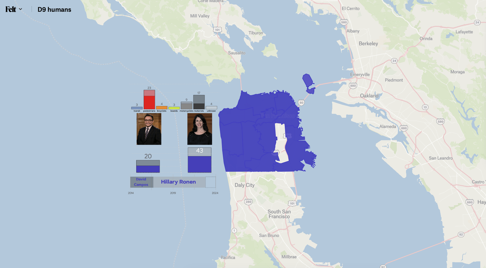
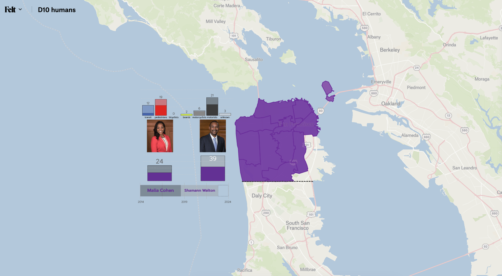
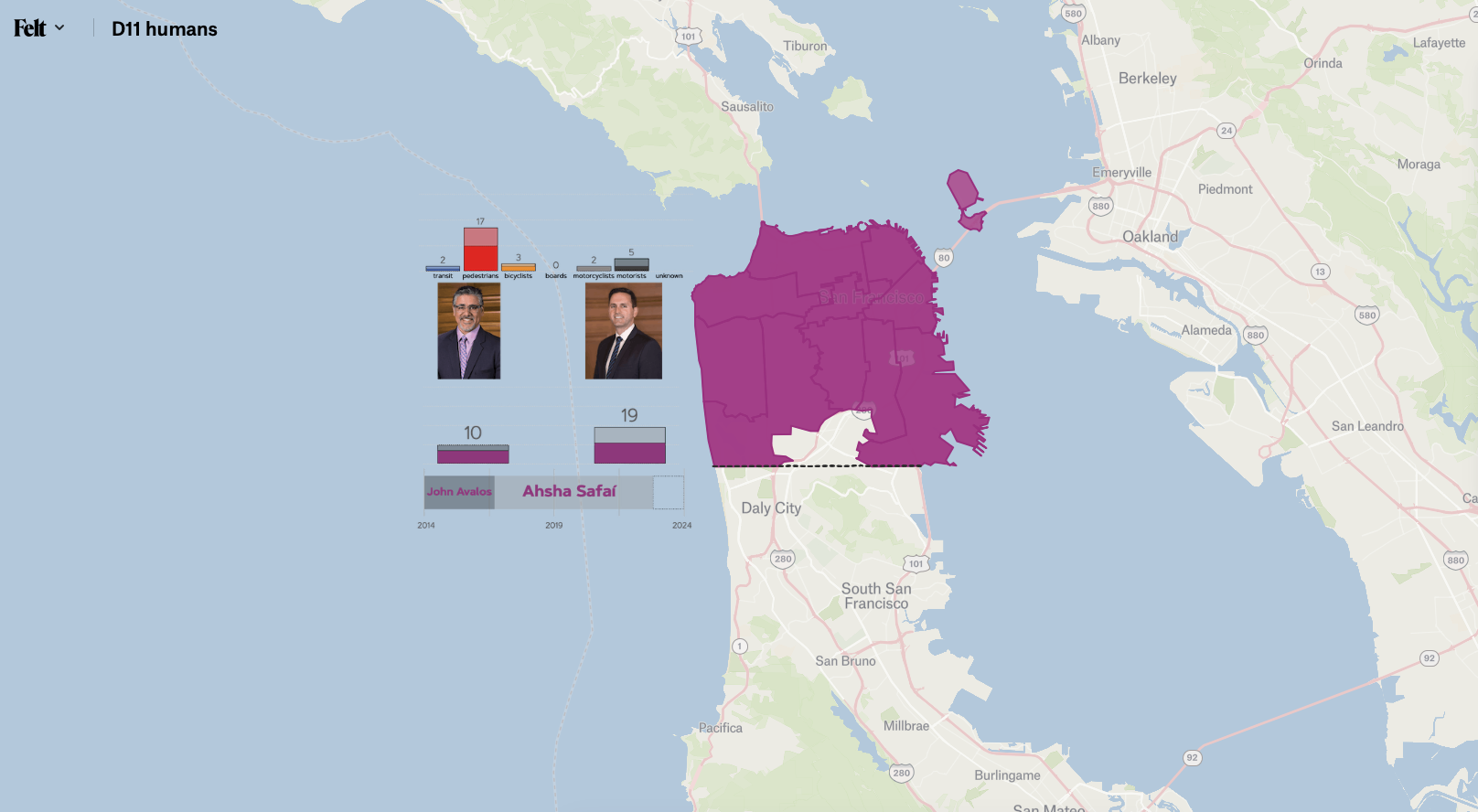
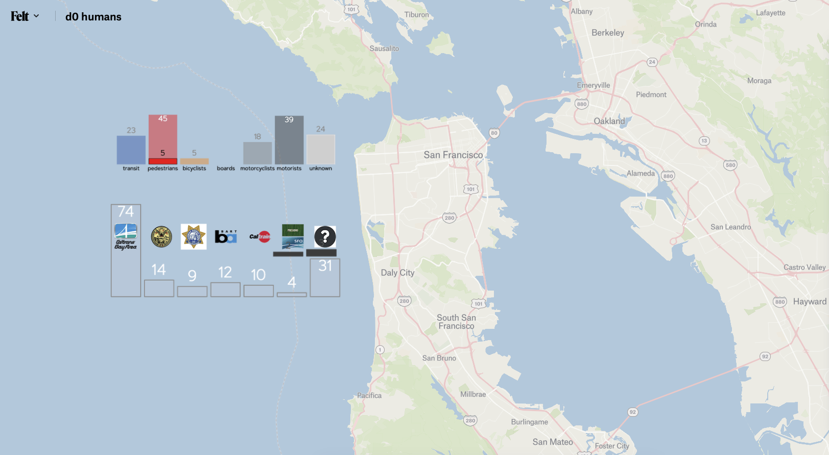
Transportation modes

The darker portion of the bar represents the number that counts towards Vision Zero deaths. The lighter portion of the bar represents the deaths that San Francisco doesn’t count. In this example there was one death due to transit included in the Vision Zero counts, but there were three more in that district that weren’t counted.

Elected Officials
The darker portion represents the Vision Zero fatalities while in office. The lighter portion represents the transportation fatalities that are not counted towards Vision Zero during their tenure. In this example, the middle bar is the ~six month term Mark Farrell served as interim mayor. In that time there were 8 deaths that were counted by Vision Zero in San Francisco, but there were at least 8 more transportation fatalities that were not counted.
TENURE IN OFFICE
A simple bar graph representing their time/dates in office.

Vision zero
+ = Identified victim
• = Unidentified victim
Transportation Fatality
* = Identified victim
^ = Unidentified victim
? = SFFD Traffic Collision fatal, but no corroborating news story or SFMTA data
! = CHP Traffic Collision fatal, but no SFFD data matched yet
?! = Homeless fatality. Motor-vehicle collision listed as cause of death, without location
ALL OF THE MAPS
San Francisco is both a city and a county. Instead of having city council members, we have city supervisors. The city is divided into 11 districts of approximately equal population size. The districts are realigned every 10 years after census data is finalized. This last happened in the spring of 2022, and was a very contentious process. The lines happen to be where there aren’t residents to fight — along major thoroughfares and highways. The problem is that those areas on the district fringes are also the most dangerous for humans.
There are 13 maps. The links to them are below:
a map for each of the 11 districts - 2022 district configurations
a map which has all of San Francisco combined.
a map for District Zero. This is the imaginary district responsible for the very real traffic fatalities which San Francisco does not include in their Vision Zero counts.
There are many reasons to show the maps by district, and that is covered further in the “What these maps are about” section, but the main reason relevant to this page is that there is so much information included that it is tough to take it all in at once. Looking at it by supervisorial district is a decent way to begin.
Click on any of the maps below to launch the real map at Felt.com in a new window. The unshaded portion of San Francisco is the are of the city which will be viewed.
This window will stay open until you close it. There is more guidance below these map links.

Map Orientation
The charts on the left and the basic map markings are noted above. The next set of guidance is here. I’ll use D10 as an example. All District maps should follow this pattern:

Vision Zero vs. Transportation Fatalities
Each map has “* d_ TF” and “+ d_ vz”.
vz = Vision Zero Fatalities = the deaths our city counts towards their Vision Zero goal
TF = Transportation Fatalities = ALL of the transportation deaths which occurred in that district*. The * is “that I could find”. There is not one definitive source linking everything together. In all cases, Vision Zero is a subset of Transportation Fatalities. The lone exception is D0 where the reverse is true. When essentially all of D0 is attributed back to the districts where the death occurred, there is a very small subset remaining (5 of 154 deaths at this writing)
District views
d10 view and D10 View are just two layers that work together. Together they form a shield to protect you from all of the non-(district you’re looking at) data. You can hide them if you wish, but in most cases you don’t want to do that. Go to the total SF map if you really want to see EVERYTHING at once.

SFFD
This is the one thing that I’ve found to be true about SFFD - their data is pushed out nightly if not in semi-real time. It doesn’t have all of the details you would find in Traffic Injury data, but you don’t need to wait months for it either. If there is a 911 call about an injury traffic collision, SFFD is 99% the first one there. This data represents ALL SFFD Traffic Collision calls. They are recoded directly upon SFFD’s “Call Final Disposition”. The calls where the Medical Examiner was called are fatalities. If there was corroborating information like a news story, it was entered as an incident. If there isn’t, it shows up as a “??” on the map. These are certainly fatalities, but lacking other data, they remain “??” on the map.
SFFD data is especially helpful in The Presidio. San Francisco won’t report any injury crashes there - just one made it through in 9+ years.

Humans and Drivers
The traffic injury crash data is so large that it needs to be downloaded and uploaded in different passes just to get it from SF Data to my machine and then on to Felt. My first priority are people outside of motor vehicles, so that is one of the ways I broke down the data. “Humans” refers to people outside of motor vehicles. “Drivers” refers to people inside motor vehicles. Note: Of the 432 deaths in this study, it seems that just 11 do not involve a motor vehicle. So 97% of transportation deaths here are due to motor vehicles. Throw in all forms of mass transit and it’s still at 90% due to cars & trucks. No matter how you slice it, human driving - especially consumer automotive - is the problem.
In both “Humans” and “Drivers”, there shouldn’t be any 00-fatal dots that don’t have a match in Transportation Fatalities. If you have both Humans and Drivers visible, the Human dots are slightly larger than the Driver dots.
Kids, Libraries, Parks
This is how this all started. Frustrated by the lack of space for people and safe routes for humans outside of motor vehicles, I have been trying to create a citywide map for people outside of motor vehicles on-and-off since the pandemic began. The most recent iteration is here. Thanks to Luke Bornheimer for the reminder I needed to put this on Felt.

Why Kids/Libraries/Parks? Because they are places that everyone should be able to agree that everyone should be able to travel there without a car. The image of a kid walking or biking to school shouldn’t be boomer nostalgia or a weekly/monthly/annual mega-event planned by adults. Kids should be able to get where they need to go without adult supervision. Go to any other nation on earth during peacetime and they will laugh that this is a sentence that needs to be uttered.
Kids: all schools, preschool - 12th, after school programs, and playgrounds. You’ll also find the fastest indicator of a troubled intersection - Crossing Guards. This is the kid version of calling for enforcement. Rather than properly designing and building intersections and streets so they are inherently safe for people in and out of cars, we’ve allowed car supremacy to rule everything. And so we must pay chaperones to help reduce the chances of our kids getting killed on the way to school. What happens after school hours? You can guess.
SFPL: San Francisco Public Library.
SF Parks: One thing to note in is a nice add on, but in the Presidio and especially Golden Gate Park, some of the “Pathways” are actually lanes, streets, and even highways. But they’re nearly all colored the same. Please keep this in mind for the larger parks. I’ll try to resolve this. An interim fix is to hide “Paths” and “Parks” (that’s just the generic green). Then you can see the crashes involving Humans and Drivers more clearly.